CSF Brand Assets
These guidelines describe the visual and verbal elements that represent CSF Cooling Experts corporate identity. This includes our name, logo and other elements such as color, type and graphics.
Sending a consistent and controlled message of who we are is essential to presenting a strong, unified image of our company.
These guidelines reflect our commitment to quality, consistency, and style.
Logo
Our Logo is the key building block of our identity, the primary visual element that identifies us. The signature is a combination of the logo and our company name – they have a fixed relationship that should never be changed in any way.
CSF Logotype
The CSF Cooling Experts Masterbrand or Corporate Logo comprises two elements, the logo symbol, and logotype. The Logo Symbol is a powerful image evoking the culture of the automotive industry.
The Logo Type has been carefully chosen for its modern and yet refined, sporty style, that embodies speed, power, and authority. The typeface balances perfectly with the logo symbol.
The corporate logo is presented through the use of color as well as shape and form. Bright red commands attention and the checkered flag pattern speaks to the ultimate sport.
3D LOGO


- The Logo Symbol
Red attracts the eye first, bringing attention to “CSF”. The gear shape and checkered pattern clearly identify the automotive industry in which we serve. - The Logo Title
Carefully chosen for its modern and yet sporty style, this text embodies speed, power and authority. The font that is used here is Exo. On dark backgrounds, the logo title should be displayed in white.
STENCIL
Stencils can be used in few scenarios; when on a vehicle, product, t-shirt, specific projects and the placement of other logos that are also stenciled – with approval by CSF Cooling Experts. Other than these specific situations, the full 3D logo should be used. Stencils can be colorized with approval by CSF Cooling Experts.


Logo Construction, Sizing & Spacing
It is important to keep corporate marks clear of any other graphic elements. To regulate this, an exclusion zone has been established around the corporate mark. This exclusion zone indicates the closest any other graphic element or message can be positioned in relation to the mark of the symbol itself and our company name – they have a fixed relationship that should never be changed in any way. Any application of the CSF logo must be large enough to read the logo text.

Whenever you use the logo, it should be surrounded with clear space to ensure its visibility and impact. No graphic elements of any kind should invade this zone.
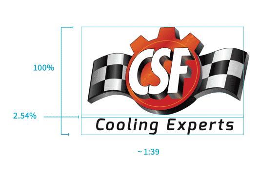
The space between the logo image and logo text is 2.54% of the height of the logo and text combined. This is approximately a 1:39 ratio.
Do not alter the space between the logo and the text.
3D LOGO GOOD USAGE EXAMPLES



3D LOGO BAD USAGE EXAMPLES
Don’t change the logo orientation
The logo should always be level and at 0°.

Don’t add effects to the logo
Other than an outer glow or drop shadow to enhance the legibility of the text and logo against an appropriate background, there can’t be any effects applied.

Don’t place the logo on a busy photograph or pattern
This would interfere with the clear space around the logo. Apply an all-black fill at 50% to the background before applying the logo.

Don’t change the logo colors
Unless the flat version of the logo is used, and approved, the logo colors must remain as is.

Don’t manipulate the text as it relates to the logo
The text placement, size, font, weight – everything must remain the same and proportional.

Don’t exclude the logo text
The tagline and logo are always a single unit and should never be separated or altered.

Fonts & Typography
Typography plays an important role in communicating an overall tone and quality. Careful use of typography reinforces our personality and ensures clarity and harmony in all CSF Cooling Experts communications. Exo and Open Sans are the fonts used.
Exo injects energy and sport into communications as the primary heading font. Open Sans, the secondary corporate typefaces makes for clear and legible body copy. Both are Google fonts and therefore freely available for web and print.
BODY FONT — OPEN SANS
Open Sans is a humanist sans serif typeface designed by Steve Matteson, Type Director of Ascender Corp. This version contains the complete 897 character set, which includes the standard ISO Latin 1, Latin CE, Greek and Cyrillic character sets. Open Sans was designed with an upright stress, open forms and a neutral, yet friendly appearance. It was optimized for print, web, and mobile interfaces, and has excellent legibility characteristics in its letterforms.
BOLD
A B C D E F G H I J K L M N O P Q R S T U V W X Y Z
a b c d e f g h i j k l m n o p q r s t u v w x y z
ITALIC
A B C D E F G H I J K L M N O P Q R S T U V W X Y Z
a b c d e f g h i j k l m n o p q r s t u v w x y z
REGULAR
A B C D E F G H I J K L M N O P Q R S T U V W X Y Z
a b c d e f g h i j k l m n o p q r s t u v w x y z
BOLD-ITALIC
A B C D E F G H I J K L M N O P Q R S T U V W X Y Z
a b c d e f g h i j k l m n o p q r s t u v w x y z
HEADER FONT – EXO
Exo is a contemporary geometric sans serif typeface that tries to convey a technological and futuristic feeling while keeping an elegant design. Exo was meant to be a very versatile font, so it has 9 weights (the maximum on the web) each with a true italic version. It works great as a display face but it also works good for small to intermediate size texts.
BOLD
A B C D E F G H I J K L M N O P Q R S T U V W X Y Z
a b c d e f g h i j k l m n o p q r s t u v w x y z
ITALIC
A B C D E F G H I J K L M N O P Q R S T U V W X Y Z
a b c d e f g h i j k l m n o p q r s t u v w x y z
REGULAR
A B C D E F G H I J K L M N O P Q R S T U V W X Y Z
a b c d e f g h i j k l m n o p q r s t u v w x y z
BOLD-ITALIC
A B C D E F G H I J K L M N O P Q R S T U V W X Y Z
a b c d e f g h i j k l m n o p q r s t u v w x y z
Brand Colors
CMYK: C 11 M 100 Y 100 K 3
RGB: R 206 G 12 B 16
HEX: #CE0C10
CMYK: C 75 M 68 Y 67 K 90
RGB: R 0 G 0 B 0
HEX: #000000
CMYK: C 0 M 0 Y 0 K 0
RGB: R 256 G 256 B 256
HEX: #FFFFFF
